How We Made the brai Logo with AI
by Bry Ale
A logo for a small software project called brai (pronounced "bry"), designed in one chat session with an AI assistant. Each round below has the artifact it produced. All geometry numbers use the 800-unit grid the drafts share.
Round 1 - Ten concepts
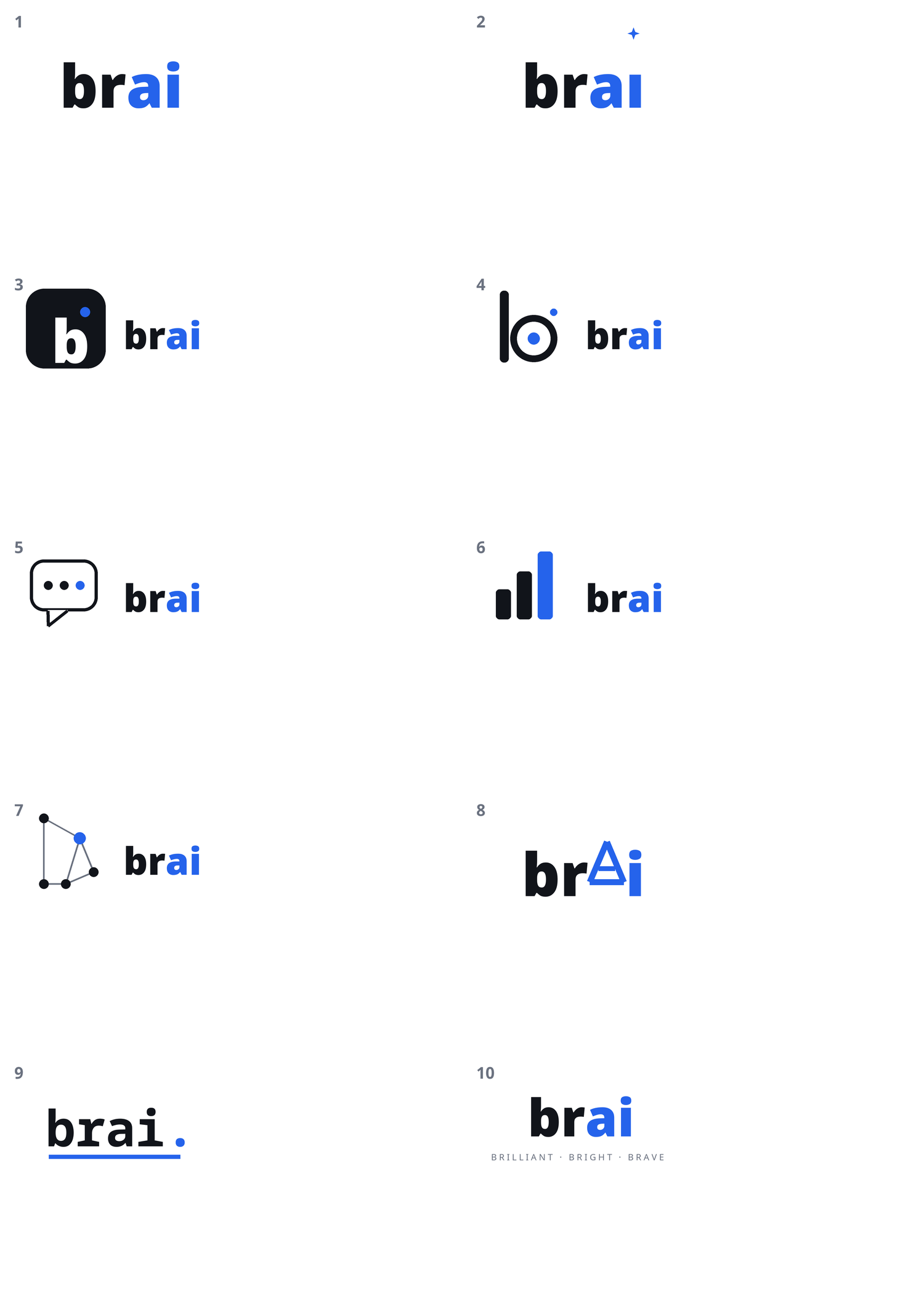
The first ask was simply ten different concepts for a four-letter name. Letterforms, rings, knots, and wordmarks all showed up. Most were generic; a few shapes were worth keeping in play.
Round 2 - A reference pass
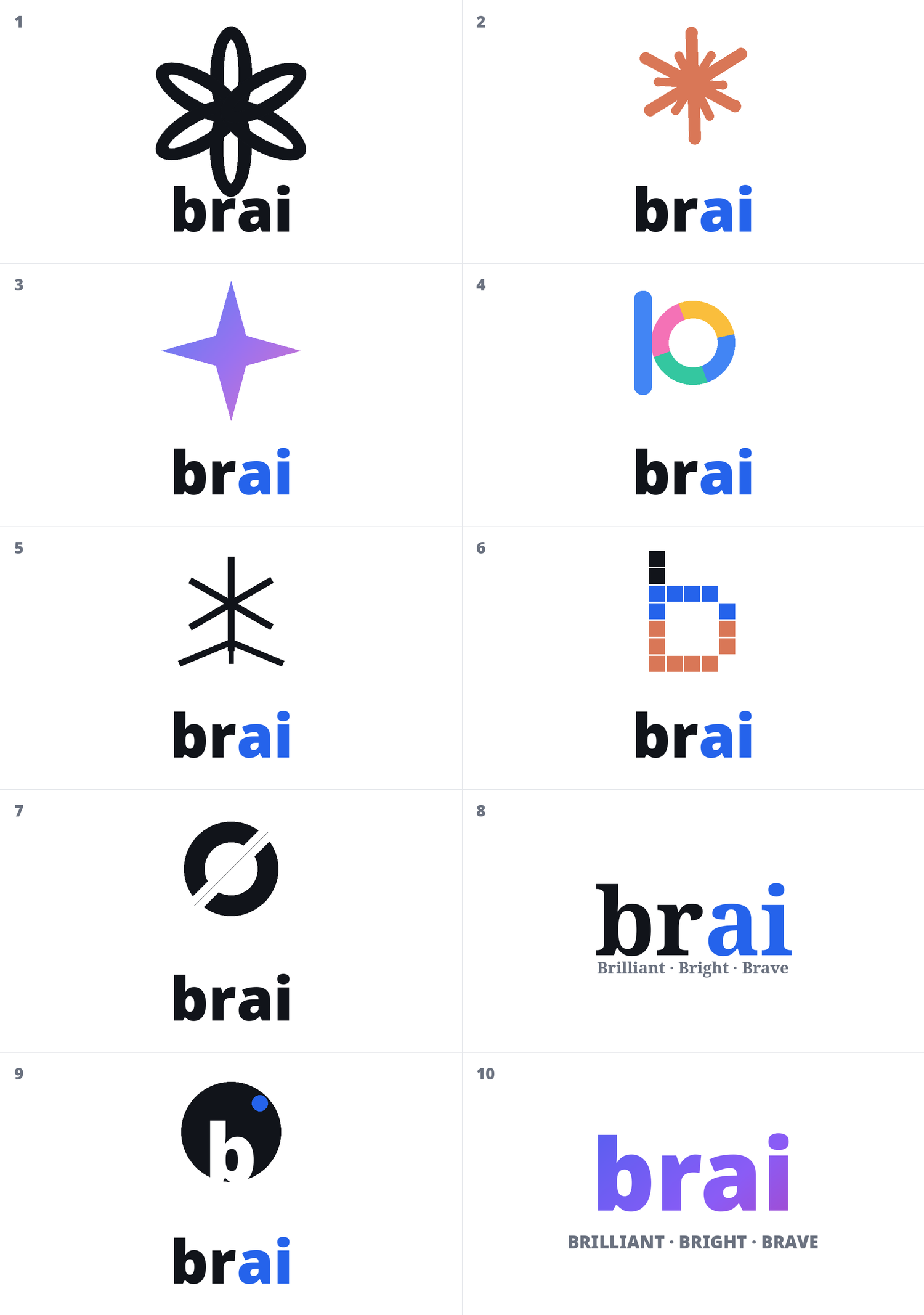
The second set was redone after looking at how existing marks are built: stroke discipline, negative space, how much detail survives at small sizes. The drafts got cleaner, but nothing yet read as a letter, and a logo that is only a shape has to be explained every time.
Round 3 - Rules
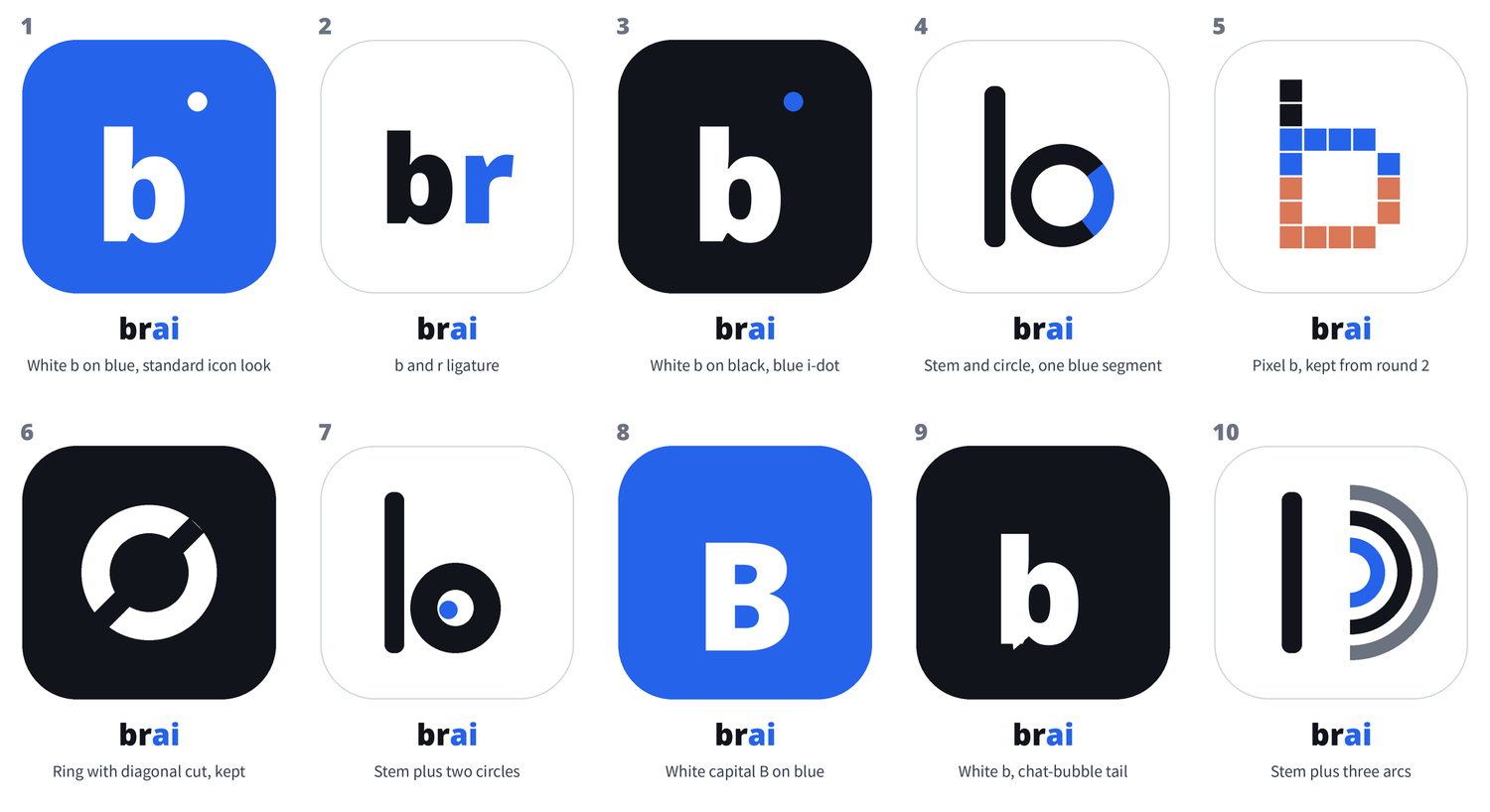
By the third set, the rejections had turned into rules. The mark must contain the letter b. It must not resemble the best-known AI symbols - no interwoven knot, no starburst. Wordmark-only entries are out. Stem-and-circle marks may stay, because they are one step from a b. One correction came out of this round: a stem next to a circle had been reading as the letters "Io". Lowering the circle until its bottom aligned with the bottom of the stem made it read as a b.
Round 4 - The ring, the slash, and a stem
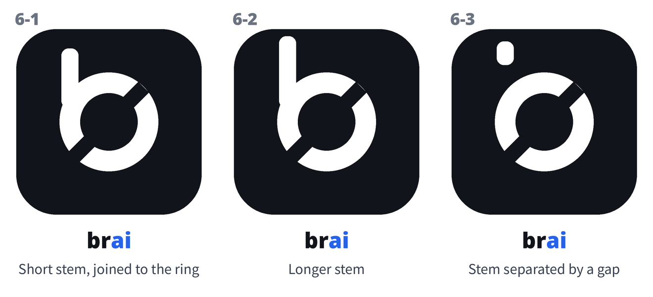
Concept 6 was a ring cut by a contained diagonal slash. A web check found the problem: it sits close to the current mark of a well-known AI company. The direction was kept anyway, on one condition - it had to stop being only a ring. A short vertical stem at the upper left turns the ring into the bowl of a b. Several stem forms were tried; stems merged into the ring were rejected, because the join looked accidental.
Round 5 - The curved gap
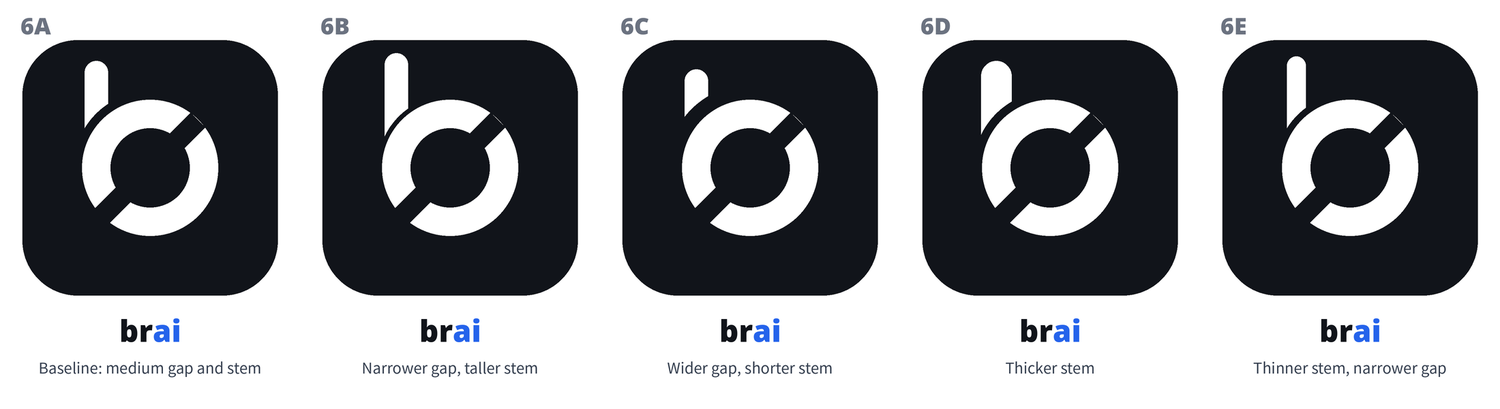
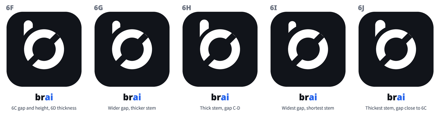
The fix for the join: the stem does not touch the ring at all. A black gap separates them, and the edge of the gap is an arc concentric with the ring, so the separation looks machined rather than broken. Two batches explored the gap width and the stem length (6A-6E, then 6F-6J).
Round 6 - One seam width, and a hairline bug
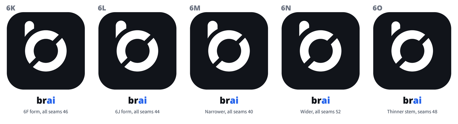
The mark has three seams: the arc gap, and the two cuts where the slash passes through the ring. The ruling was that all three must be the same width - one number, not three similar ones. Batch 6K-6O was drawn under that rule. This round also produced a defect: a white hairline at the slash crossings, visible only in zoomed crops. The cause was measured, not guessed: the slash ended at radius 209.3, just inside the ring's outer radius of 210, leaving a sliver of background. Extending the slash past the ring removed it.

Round 7 - The pick
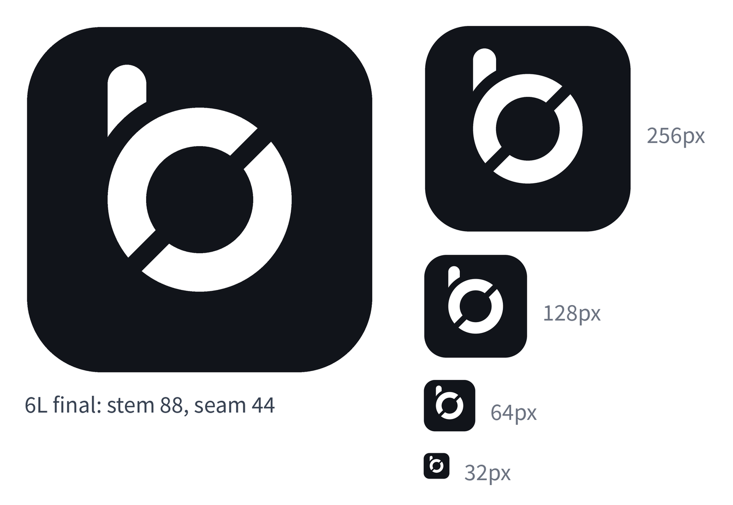
Between the last two candidates, 6L won over 6K, with one adjustment: the stem was thinned to 88, exactly the ring's stroke width, so the mark uses one stroke weight throughout. Form at this point: stem 88, ring stroke 88, unified seam 44.
Round 8 - A symmetry test
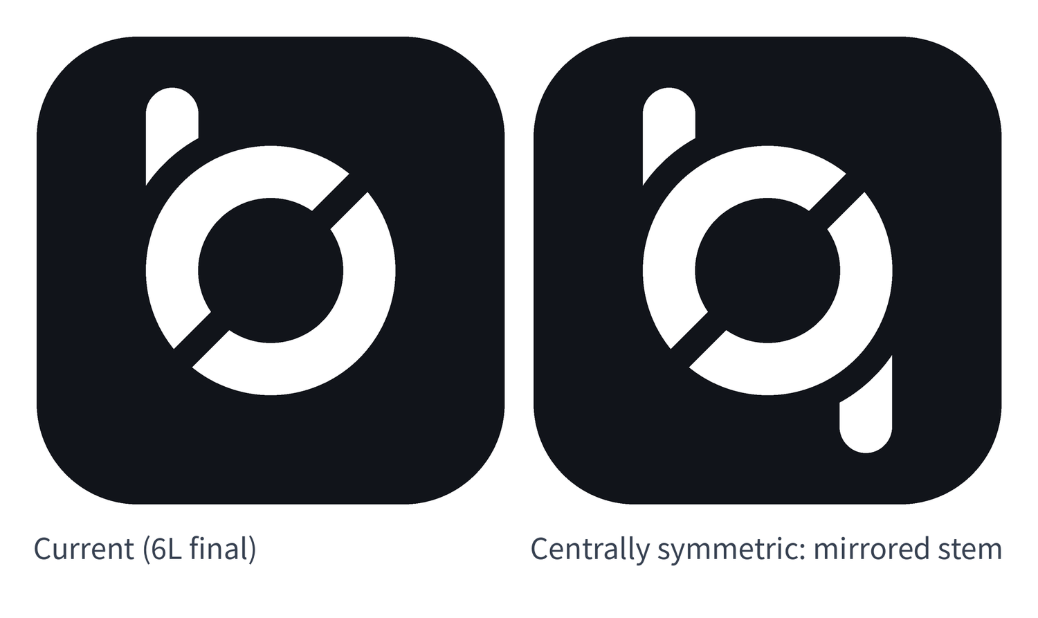
A second stem was added at the lower right, the exact 180-degree rotation of the first. The symmetry is real, and it costs the letter: with two stems, the mark stops reading as a b and starts reading as a symbol. Kept as a test, not as the mark.
Round 9 - A diagonal test
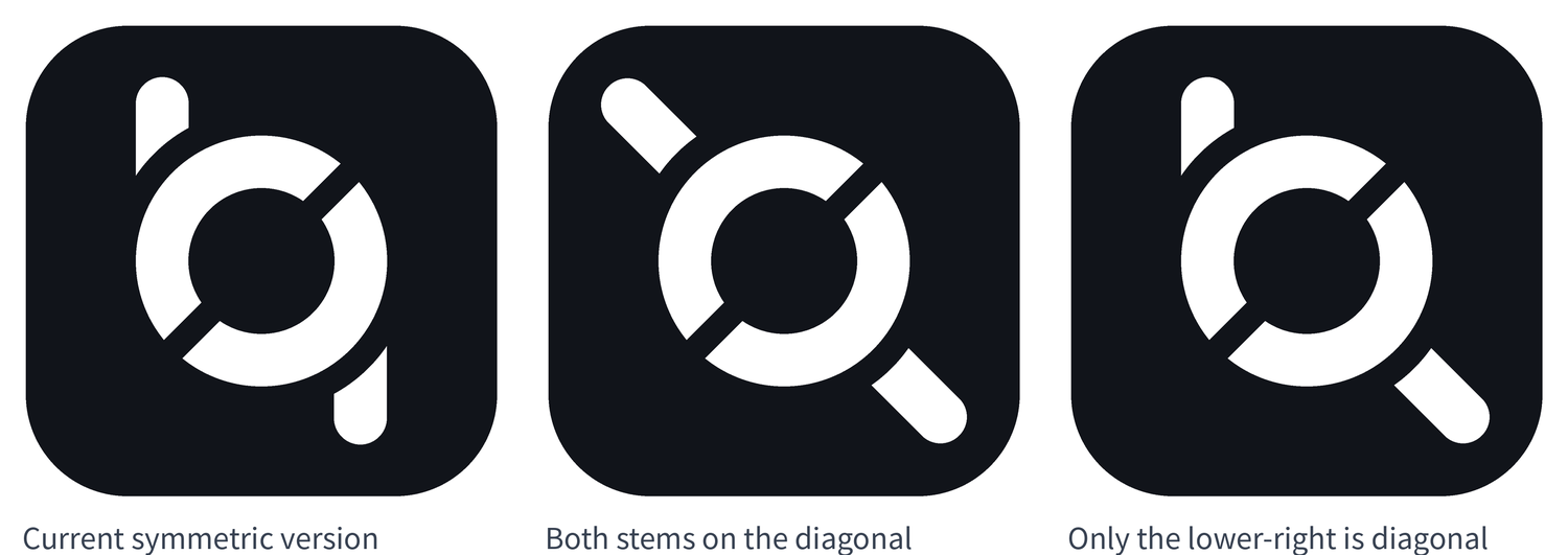
The lower-right element was then abstracted: a short stem pointing down-right at 45 degrees, along the slash's own diagonal. Two variants were drawn - both stems on the diagonal, or only the lower-right one. The second was chosen: the upper-left stem stays vertical, the lower-right stem goes diagonal and shorter.
Round 10 - Letters in the corner
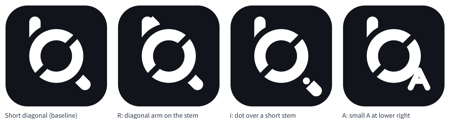
Before settling, the lower-right element was asked to carry a letter: an R, or an A. The R's arm read as a small triangular flag. A literal A was readable but looked pasted on, and it needed thinner strokes than everything else in the mark. The only viable letter reading was an i - a dot over the short diagonal stem.
Round 11 - Paper
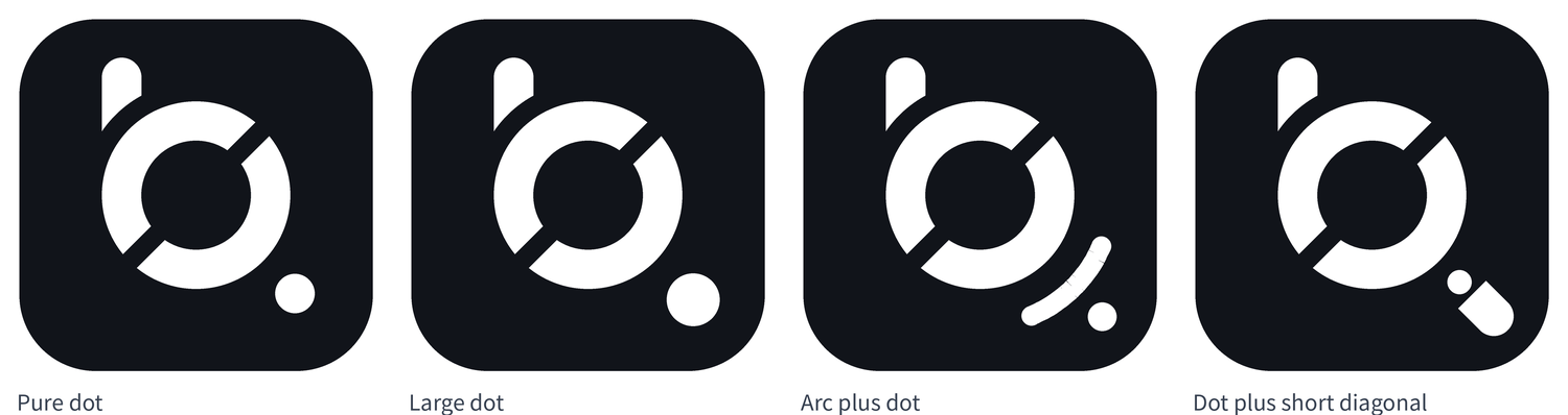
The corner was then sketched by hand, on paper, several ways. The version that felt best was the simplest: a plain dot, no stem at all. Four mocks were built from the sketches: a pure dot of diameter 88, a larger dot of 118, an arc segment with a dot, and a dot with a short diagonal stem. The pure dot won - it speaks the ring's own circular language and survives small sizes. The arc version was the weakest; it read as a signal icon.
Round 12 - Dot tuning
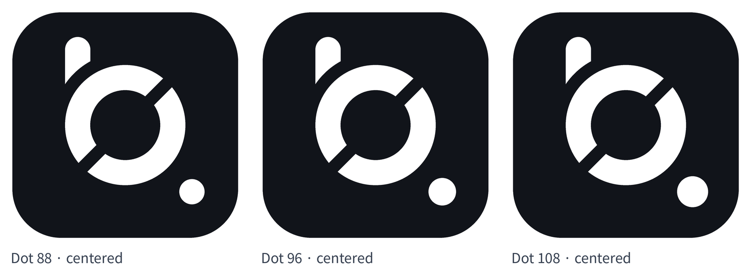
Three sizes (88, 96, 108) were compared at radius 312. The position then moved out to 348 - halfway between the ring's edge and the tile's corner - and back in to 330, which balanced better against the ring. The middle size, 96, was picked first and then adjusted once more, to a diameter of 102.
Round 13 - Final form
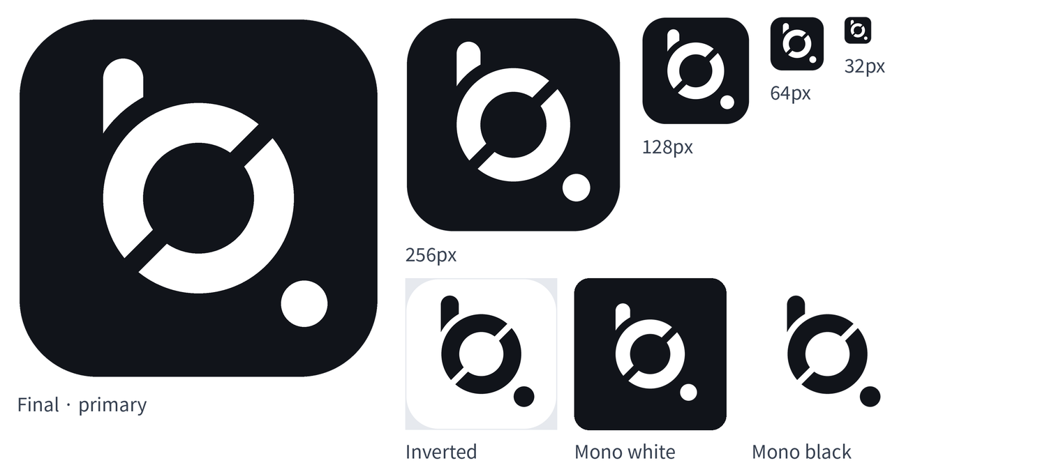
The dark version settled: stem 88, ring stroke 88, seam 44, dot of diameter 102 centered at radius 330 on the down-right diagonal. The full asset set was generated from it - tiles, monochrome versions, icons from 1024 down to 32 pixels, a favicon, and wordmark banners. At 32 pixels the stem, ring, and dot all still read.
Round 14 - The white version diverges
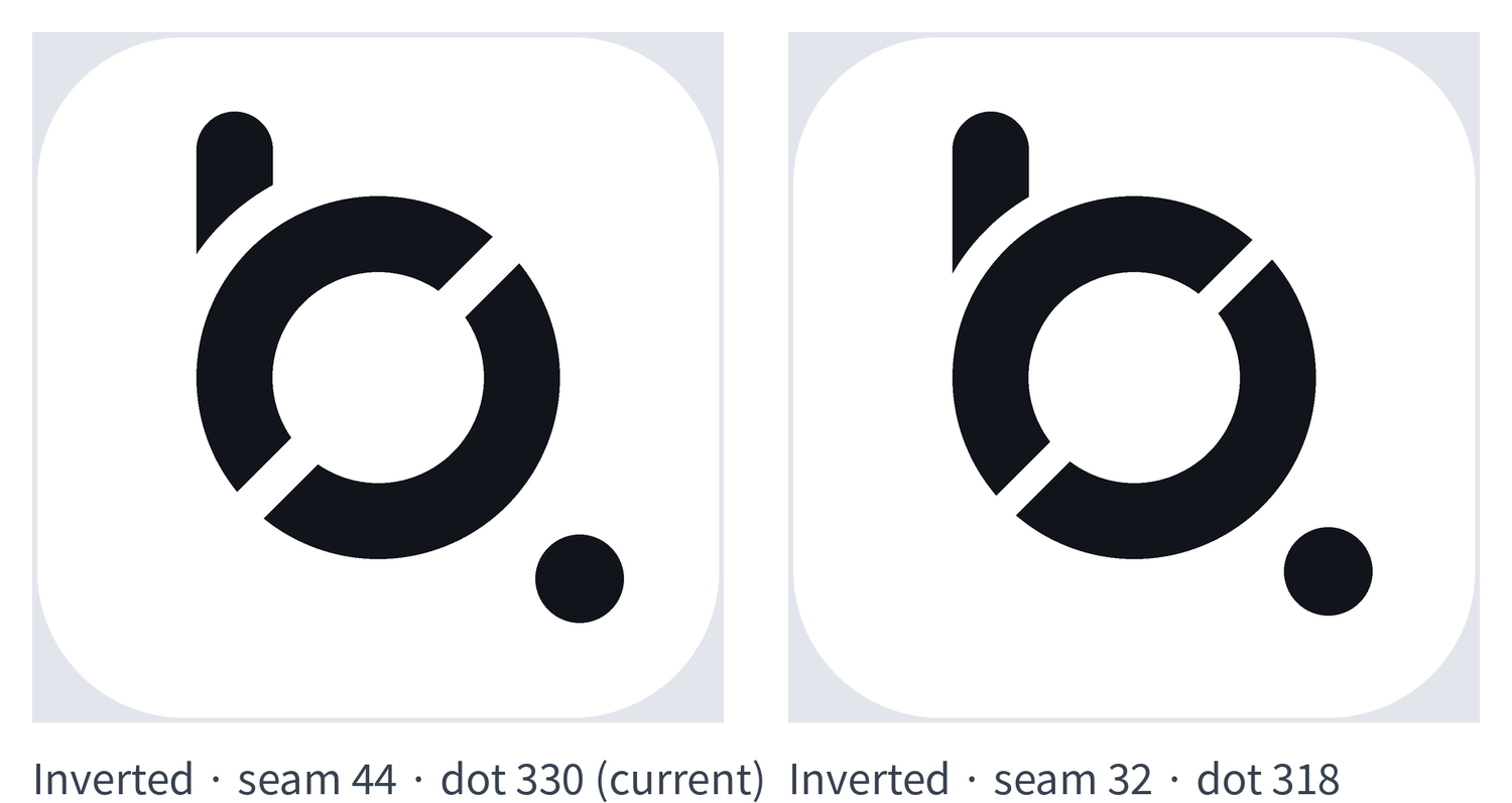
The inverted version (black mark on a white tile) was first drawn with all seams tightened to 32 and the dot pulled in to radius 318, because black on white reads thinner than white on black. The two finished files were then measured pixel by pixel: the ring width, stem width, and dot diameter came out identical, and the only real differences were the two intended ones - seam width and dot position. The rest of what the eye sees is the irradiation effect: white shapes on black expand, black shapes on white contract. The ruling stood: the two versions deliberately differ. Dark keeps seam 44 and the dot at 330; light uses seam 32 and the dot at 318.
Round 15 - Strengthening the light version
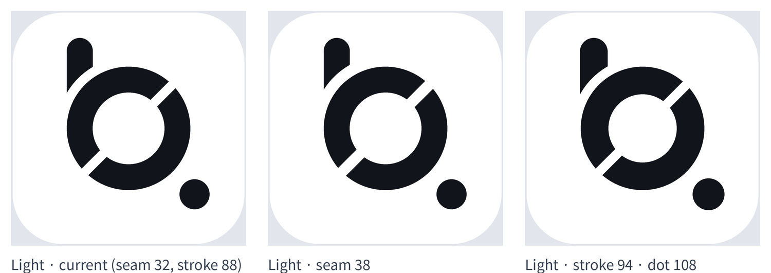
One adjustment remained. Set against the dark version, the light one still read light - not in separation, but in weight. Two candidates were drawn: seams widened from 32 to 38, or strokes thickened from 88 to 94 with the dot enlarged from 102 to 108. The second was chosen. Final light spec: seam 32, stroke 94, dot of diameter 108 at radius 318. The dark spec is unchanged.